Reimagining a core user touchpoint
A collection of UX and UI improvements to drive engagement
Date
Q2 2024
Platform
Mobile web
Role
Lead Designer
Project Overview
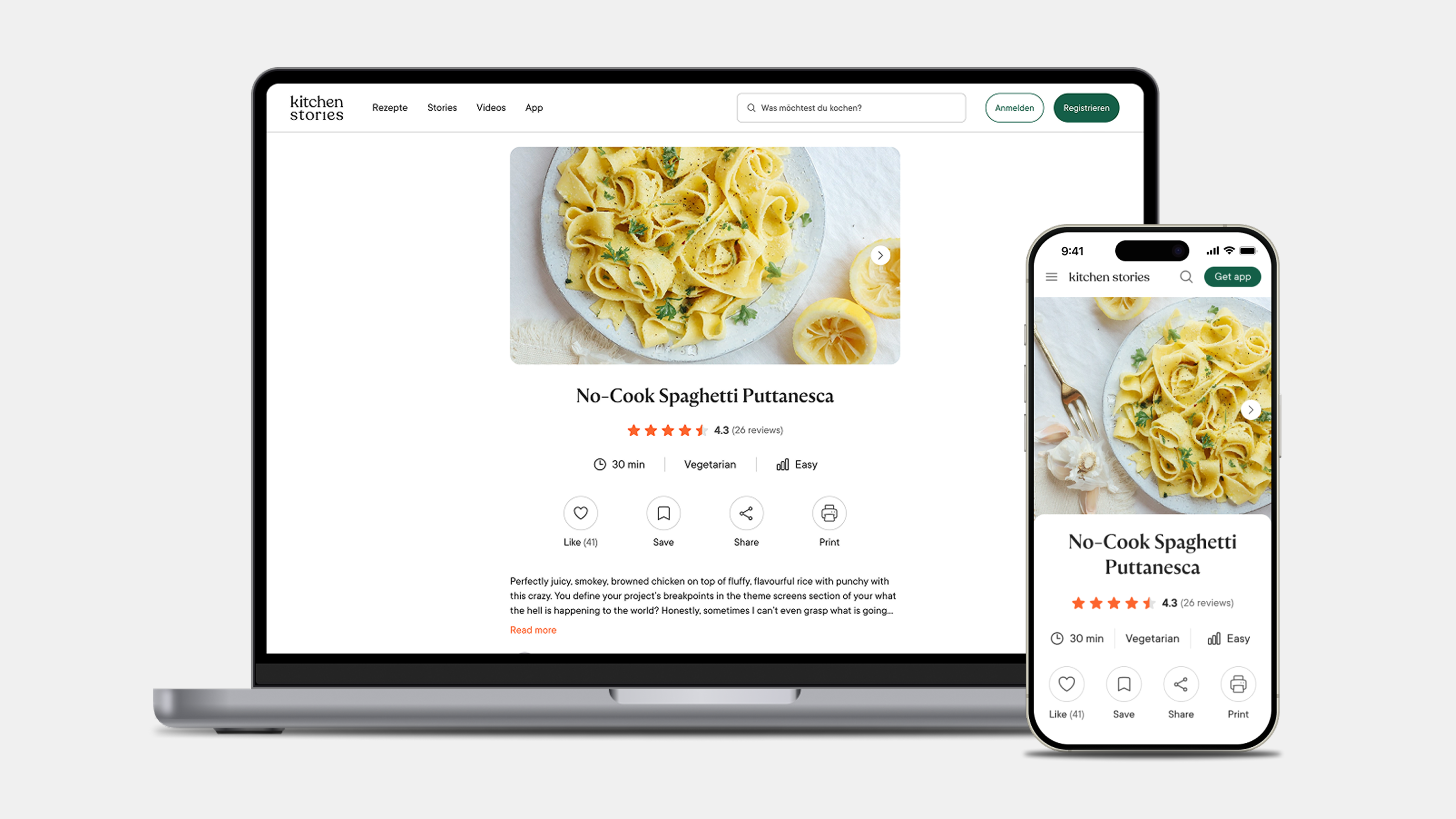
Kitchen Stories attracts many home cooks searching for recipes daily, yet its most visited page—the Recipe Details Page—hadn’t been updated in years. Engagement was low, with users quickly bouncing after skimming a recipe.
As a key bridge to the app, where engagement is higher, improving this page was a major opportunity for user retention.
I led the redesign proposal, making it more interactive, structured, and user-friendly to increase time spent, boost engagement, reduce bounce rates, and drive app adoption.
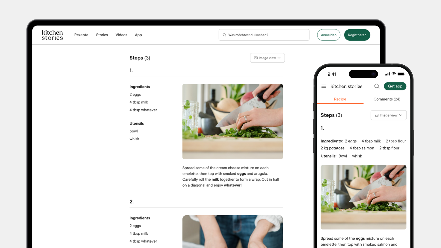
The new layout of Image View allows for better scanability.
Problem
The Recipe Details Page presented several friction points:
Outdated structure: Information was not prioritized effectively, forcing users to scroll to find essential details.
Lack of interaction: Users passively consumed the content without meaningful engagement.
High bounce rate: Many visitors left the page without saving, cooking, or engaging with the recipe.
Weak app transition: Despite the app offering a richer experience, there were limited touchpoints encouraging users to move from web to app.
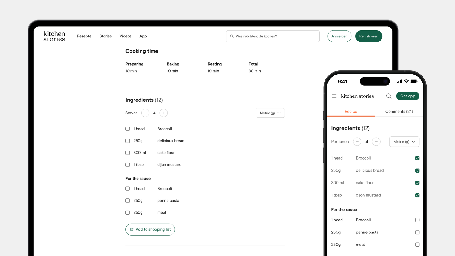
The proposed checklist for ingredients on mobile and desktop.
Solution
The redesign focused on usability, interaction, and visual clarity, making the recipe details page more engaging and easier to use. Key improvements included:
Ingredient Checklist: A checklist feature allows users to tick off ingredients they already have, making shopping and preparation easier.
Reorganized Information Architecture: We restructured the layout and information architecture to surface the most important elements first.
UI Enhancements for Key Actions: Critical actions were visually emphasized, making it easier for users to take action—whether it’s starting to cook, saving a recipe, or sharing it.
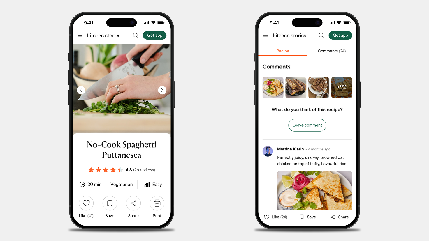
ATF displays key recipe info (left). Sticky bar for key actions (right).
Minimalist Text Mode: A distraction-free reading mode lets users focus purely on the text instructions without images or other elements.
Step-by-Step Carousel: A new carousel feature gives users a quick visual overview of the cooking process, helping them grasp the steps before diving in.
Sticky Navbar for Quick Access: A sticky navigation bar ensures that users can quickly access key actions—such as saving, liking and sharing without losing their place on the page.
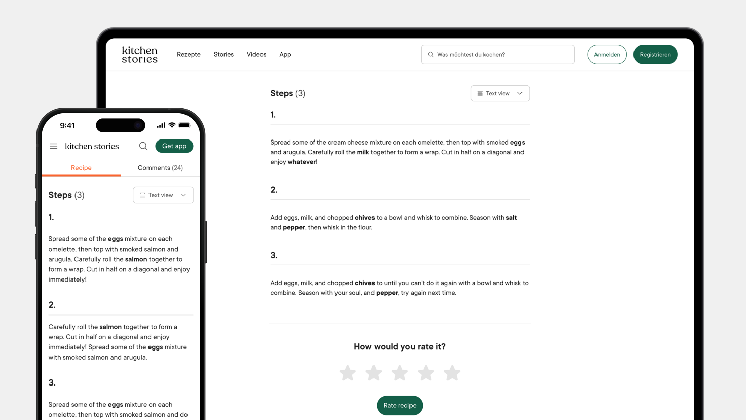
Text Mode – a clean, distraction-free experience for pure focus.
Outcome
By rolling out the redesign in phases, we measured the impact of each feature individually.
Increased engagement : Users spent more time interacting with the page, especially with the ingredient checklist and step-by-step carousel.
Reduced bounce rate : The clearer structure and interactive features encouraged users to explore further.
Improved usability : The clearer structure and interactive features encouraged users to explore further.
Stronger web-to-app conversion : The clearer structure and interactive features encouraged users to explore further.
By rethinking the Recipe Details experience, we transformed the page from a static content hub into an interactive, user-friendly tool. As the team continues testing and refining, the Recipe Details Page is evolving into a more interactive and engaging experience for home cooks.