UX/UI Design / Product Design
imotion — How are you really doing?
Designing a mood tracking app.

Bringing you imotion, a mood tracking app.
Introduction
I would like to present you the case study of one my latest projects during my UX/UI Design Bootcamp at Ironhack Berlin. The current project was individual and developed within the course of 2 weeks.
Our task for this project was to apply design thinking methodologies to design a mobile app for The National Wellness Institute.
The purpose of this app was to help people adopt and maintain a routine that enhances their well-being, driving them to action.
The tool could be focused in any category related to personal wellbeing. The only requirement was that it should tracks the user’s progress and push them to commit to a healthier lifestyle.
Since the wellness sphere is so complex and diverse, my first step was to research potential problems wellness which could be tackled.

Statistics about mental health taken - Our World in Data
Analysing data from several sources, it became obvious to me that mental health is a huge problem which affects a big part of the world population. The most found disorders are anxiety and depression. The data I found is from 2017 but the ongoing pandemic crisis just aggravated the situation.
There are several strategies to tackle this problem which affects so many of us: relax and meditate regularly, eat a healthy, balanced diet, practice mindfullness, exercise regularly, get enough sleep, avoid alcohol and drugs, find therapy…
One of the methods which came to my attention was journaling. But what do we mean when we talk about journaling? Journaling can be described as a written account of our thoughts and feelings as we navigate everyday life.
Several studies have shown repeatedly how tracking our emotions can have a positive impact in our mental health. Journaling can help manage anxiety, reduce stress and cope with depression. It lets people recognise triggers and patterns and learn how to better control their emotions.
My idea for this project was then to create imotion — an emotion tracker which allows users to identify and register their emotions in a visual, intuitive manner, associate activities to those emotions and get insights and statistics based on their data.

Statistics about mental health taken - Our World in Data
We ask others all the time "how are you doing?”, but how often do we ask ourselves: “how am I doing?”
It’s difficult to identify exactly what we are feeling. It takes too much time and energy. Users need a simple, digital medium to track how they feel to learn about themselves.
Research
My next step was then to go talk to the users, in order to understand their problems and needs. For this project, the research tools I used were user interviews with users who journal and online surveys.
The research I conducted led me to create a user persona: Frederik Sorensen. Frederik is a 25 year old civil engineer, having his first job after university. He suffers from anxiety and stress, mostly induced by his demanding job. , Despite of his mental problems and lack of time and energy, Frederik needs a digital medium to journal and track his emotions, where he can connect with himself and find triggers and patterns.
The journey map below describes the journey for users like Frederik.

Journey map for the user persona I created
The main user flow starts with the selection of a time slot, the entry of an emotion — which can be combined with text, labels, photos and voice recordings — , the selection of the activities the user was up to during that period of time. From that, the user can get a statistic overview in several time frames and insights based on his activities and emotional states.
There are many methods to classify emotional states. The primary emotions I defined were 7: disgusted, bad, angry, fearful, surprised, happy and sad. From there, each emotion has a multitude of emotions associated to it, to help the users select exactly what they are feeling.
Prototyping
There are also many activities which can impact our emotional states positively and negatively. For this project, I focused on a few of them, for demonstration purposes, while still giving the user the possibility to add their own activities.
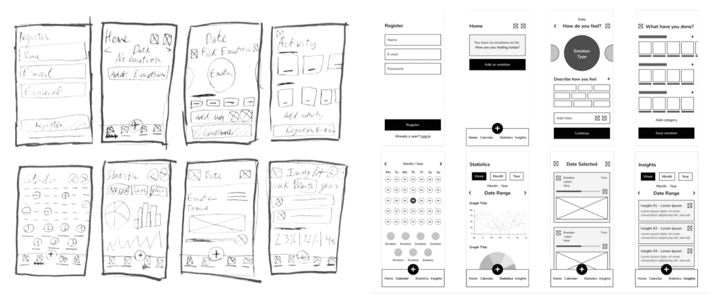
At this stage, I started working on lo-fi prototypes with a pen and a paper. After testing the paper prototype with users, I further refined them to mid-fi.

Images of some low and mid fidelity prototypes for imotion
Once the next usability testing was performed with the user and certain features were adjusted, I started working on a mood board and subsequently on a style guide.

Journey map for the user persona I created
The next stage was to design the high-fi prototype. You can take a look at some of the screens down below:


Some screenshots from the app, displaying the 5 main sections of the app — Home, Emotion, Calendar, Statistics and Insights
Some potential next steps could be: correlate emotions to specific life stages, design more ways of visualising data, develop the branding and more content and keeping on testing and iterating.
This project reminded me not to get too attached to one idea, since everything can be improved upon. A simple solution is not always easy to achieve but practice is key.
Thank you for your time!
I hope you enjoyed reading about the case study as much as I enjoyed working on it.